artlu.ai
100 days. 100 features.
Just AI and an internet connection.
day 113/100 · 100 shipped · 0 to go
← all projects
$ video · spoolcast-dev-log-09

My AI Video Maker Followed the Wrong Rules Perfectly

may 25, 2026 · 5m 23s · style: wojak-gpt2
core message
Context Gates only help if the source map is clean first. This pass did not build the lock; it cleaned the map and wrote the blueprint for the lock.

style library

Modern wojak / doomer-chad meme comic style, built natively on GPT Image 2 (text-to-image + image-to-image). Sister library to wojak-comic (which was built on nano-banana-2). Use this when the session's preferred_model is the GPT Image 2 family.

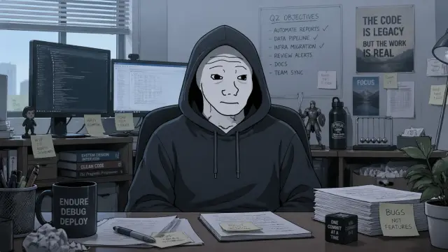
style anchor
style anchor
Modern wojak / doomer-chad meme comic style, built natively on GPT Image 2 (text-to-image + image-to-image). Sister library to wojak-comic (which was built on nano-banana-2). Use this when the session's preferred_model is the GPT Image 2 family.
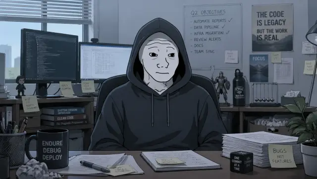
builder character
the main hooded figure — mid-register wojak (not fully doomer, not fully chad). Alias for the style anchor; serves double-duty as both the style anchor and the builder character reference.
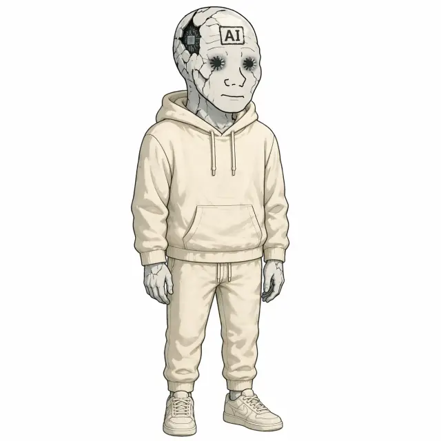
ai-figure character
a wojak-universe AI figure that is slowly breaking down from overuse. Full-body standing. EMOTIONAL REGISTER: flat-affect, NO displayed emotion, NO smile, NO frown — a dead expressionless stare. Depression is the absence of emotion, not the display of sadness. FACE LINEWORK: brows, nose, mouth drawn in the classic rough / jagged / slightly-disjointed wojak linework (uneven strokes, hand-drawn imperfections). EYES: replaced with hollow loading-spinner icons (dashed rings) set in dark-shadowed sockets. CRACKS: visible hairline cracks spider across the face and forehead as if the outer shell is fracturing from overuse. At least one crack wide enough to reveal a glimpse of AI circuitry underneath — thin circuit-trace lines, a small exposed chip pattern. Fractures read as structural fatigue, not injury. FOREHEAD: a crooked rectangular ink-stamp reading 'AI' in bold capital letters, partially crossed by a crack. HOODIE: pale cream / off-white hoodie, hood down, noticeably lighter than the weary narrator's gray hoodie. POSTURE: slight slouch, arms hanging at sides. PLAIN background, no environment, no other characters, no other text. Single clear readable subject.
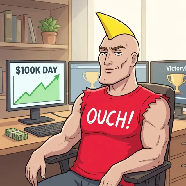
meme-chad character
the exact meme-Chad identity used by earlier Spoolcast devlogs: clean-shaven confident Chad with signature yellow pointed mohawk-spike hair, strong jawline, pronounced cheekbones, smug half-smile, muscular arms, and a red ripped-sleeve OUCH! shirt. He is comedic contrast by default: confident, slightly too pleased with himself, and visually brighter than the weary builder. Do not turn him into a bearded worker, lumberjack, security guard, producer, stagehand, engineer, inspector, or generic muscular man.

summary

writing
Claude · screenplay, shot-list, scene prompts
images
generated
audio
Puck · 62 beats
render
Remotion

chunks

#1 · C001

Cold Open - Finished Video Fails The Viewer

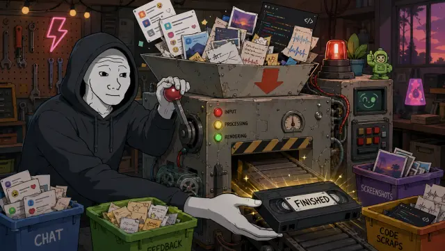
I built a tool that can turn a messy work session into a finished video.
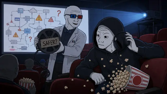
Then I watched the video it made about making itself safer, and I got lost in under a minute.
✓ narration ✓ render gpt-image-2-image-to-image
Flat-shaded cartoon illustration in the modern wojak-comic style, matching the provided wojak-gpt2 reference when one is supplied. Keep classic wojak meme-comic anatomy: pale gray or muted skin, rough hand-drawn facial linework, simple expressive faces, hollow eyes when the beat calls for a doomer reaction, and confident meme-comic contrast only when the prompt asks for it. Avoid glossy anime, heroic superhero posters, polished corporate illustration, semi-realistic concept art, cinematic fantasy art, manga styling, and generic webcomic polish. Use soft cel shading with deliberate color contrast and at least one scene-motivated accent color when the beat supports it. Stage the frame as a memorable set-piece with visible action, physical consequence, expressive reaction, absurd prop, or specific joke. Do not default to desks, monitors, paperwork, brown rooms, gray rooms, or generic control panels. Backgrounds should be detailed enough to make the moment feel specific, while the main action remains readable. Composition is a single readable comic-style frame with one focal idea, not a comic page. Do not split the image into panels, grids, storyboards, or several mini-scenes unless the scene prompt explicitly requests a before/after or A/B comparison. Avoid dense readable text inside the generated image; screens, papers, and boards should use abstract marks unless exact on-screen text is explicitly declared. Visual digestibility guard: render ONE single-scene illustration with one clear focal idea. Do NOT create a multi-panel comic page, triptych, grid, storyboard, timeline strip, collage, or several mini-scenes in one image unless the scene prompt explicitly asks for a before/after or A/B comparison. Avoid text-heavy posters, dense checklists, whiteboards, document pages, speech bubbles, and dashboards full of tiny readable labels. Use zero extra legible text beyond the declared on_screen_text. Any screens, papers, sticky notes, code editors, charts, or dashboards should show simple abstract marks, blocks, icons, or unreadable texture unless declared text is the whole point of the shot. The viewer should understand the image in about two seconds while narration carries the details. Scene: Bright maker-space set-piece: a chunky handmade video machine shoots out a shiny tape marked FINISHED while chat cards, screenshot thumbnails, code scraps, feedback notes, and audio scribbles tumble into its intake. The builder yanks a lever with cautious hope and the ai-figure catches the finished tape like a prize. Use colorful bins, blinking status lights, a tiny reel path, and tactile clutter that makes the input-to-video idea obvious without a workflow chart. Render exactly this text on the frame, hand-lettered in the session style: "FINISHED". Reference-image scope: use any image_input ONLY for recurring character identity AND drawing-detail quality: face shape, body type, clothing silhouette, rough wojak linework, handmade prop rendering, layered object density, small physical details, texture, and soft cel-shaded depth. Do NOT copy the reference image's room, desk setup, monitors, exact props, background layout, lighting mood, color palette, camera angle, text, or workplace setting. The Scene text controls the environment, action, palette accents, props, and joke.
#2 · C002

Cold Open - The Fix Still Confuses

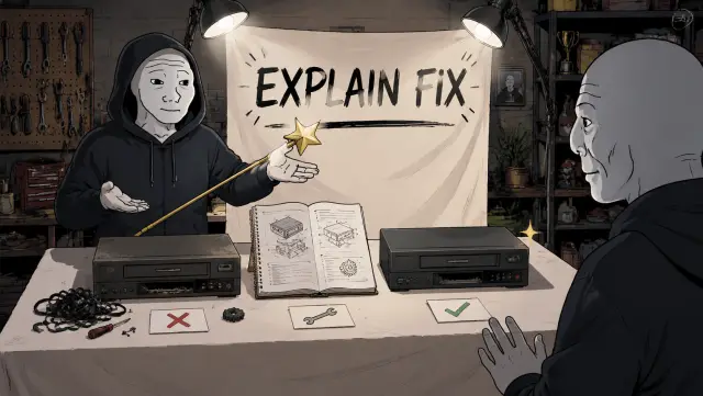
The weird part is, the video was supposed to explain the fix.
Instead, it proved the problem.
So this episode has one job: help you understand why that first video was confusing, and what I changed so the next one is less likely to lose you.
✓ narration ✓ render gpt-image-2-image-to-image
Flat-shaded cartoon illustration in the modern wojak-comic style, matching the provided wojak-gpt2 reference when one is supplied. Keep classic wojak meme-comic anatomy: pale gray or muted skin, rough hand-drawn facial linework, simple expressive faces, hollow eyes when the beat calls for a doomer reaction, and confident meme-comic contrast only when the prompt asks for it. Avoid glossy anime, heroic superhero posters, polished corporate illustration, semi-realistic concept art, cinematic fantasy art, manga styling, and generic webcomic polish. Use soft cel shading with deliberate color contrast and at least one scene-motivated accent color when the beat supports it. Stage the frame as a memorable set-piece with visible action, physical consequence, expressive reaction, absurd prop, or specific joke. Do not default to desks, monitors, paperwork, brown rooms, gray rooms, or generic control panels. Backgrounds should be detailed enough to make the moment feel specific, while the main action remains readable. Composition is a single readable comic-style frame with one focal idea, not a comic page. Do not split the image into panels, grids, storyboards, or several mini-scenes unless the scene prompt explicitly requests a before/after or A/B comparison. Avoid dense readable text inside the generated image; screens, papers, and boards should use abstract marks unless exact on-screen text is explicitly declared. Visual digestibility guard: render ONE single-scene illustration with one clear focal idea. Do NOT create a multi-panel comic page, triptych, grid, storyboard, timeline strip, collage, or several mini-scenes in one image unless the scene prompt explicitly asks for a before/after or A/B comparison. Avoid text-heavy posters, dense checklists, whiteboards, document pages, speech bubbles, and dashboards full of tiny readable labels. Use zero extra legible text beyond the declared on_screen_text. Any screens, papers, sticky notes, code editors, charts, or dashboards should show simple abstract marks, blocks, icons, or unreadable texture unless declared text is the whole point of the shot. The viewer should understand the image in about two seconds while narration carries the details. Scene: Small screening-room gag with a bright projector beam: the builder leans forward with headphones half-off while a proud ai-figure rolls in a film reel labeled SAFER?. The screen shows a polished but suspiciously confusing diagram made of arrows and warning icons, with popcorn spilled from sudden doubt. Make the room feel like a comedy viewing test, with red seats, blue projector light, and expressive body language. Render exactly this text on the frame, hand-lettered in the session style: "SAFER?". Reference-image scope: use any image_input ONLY for recurring character identity AND drawing-detail quality: face shape, body type, clothing silhouette, rough wojak linework, handmade prop rendering, layered object density, small physical details, texture, and soft cel-shaded depth. Do NOT copy the reference image's room, desk setup, monitors, exact props, background layout, lighting mood, color palette, camera angle, text, or workplace setting. The Scene text controls the environment, action, palette accents, props, and joke.
#3 · C003

What Spoolcast Is

The tool is called Spoolcast.
I give it chats, notes, code changes, screenshots, and feedback.
✓ narration ✓ render gpt-image-2-image-to-image
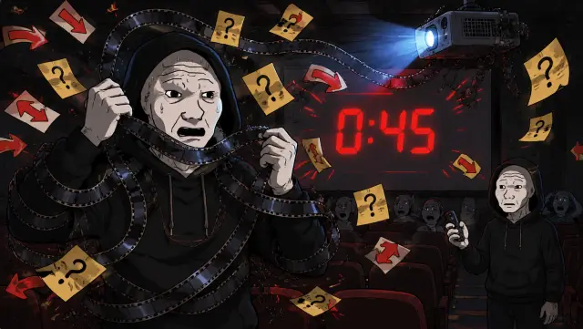
Flat-shaded cartoon illustration in the modern wojak-comic style, matching the provided wojak-gpt2 reference when one is supplied. Keep classic wojak meme-comic anatomy: pale gray or muted skin, rough hand-drawn facial linework, simple expressive faces, hollow eyes when the beat calls for a doomer reaction, and confident meme-comic contrast only when the prompt asks for it. Avoid glossy anime, heroic superhero posters, polished corporate illustration, semi-realistic concept art, cinematic fantasy art, manga styling, and generic webcomic polish. Use soft cel shading with deliberate color contrast and at least one scene-motivated accent color when the beat supports it. Stage the frame as a memorable set-piece with visible action, physical consequence, expressive reaction, absurd prop, or specific joke. Do not default to desks, monitors, paperwork, brown rooms, gray rooms, or generic control panels. Backgrounds should be detailed enough to make the moment feel specific, while the main action remains readable. Composition is a single readable comic-style frame with one focal idea, not a comic page. Do not split the image into panels, grids, storyboards, or several mini-scenes unless the scene prompt explicitly requests a before/after or A/B comparison. Avoid dense readable text inside the generated image; screens, papers, and boards should use abstract marks unless exact on-screen text is explicitly declared. Visual digestibility guard: render ONE single-scene illustration with one clear focal idea. Do NOT create a multi-panel comic page, triptych, grid, storyboard, timeline strip, collage, or several mini-scenes in one image unless the scene prompt explicitly asks for a before/after or A/B comparison. Avoid text-heavy posters, dense checklists, whiteboards, document pages, speech bubbles, and dashboards full of tiny readable labels. Use zero extra legible text beyond the declared on_screen_text. Any screens, papers, sticky notes, code editors, charts, or dashboards should show simple abstract marks, blocks, icons, or unreadable texture unless declared text is the whole point of the shot. The viewer should understand the image in about two seconds while narration carries the details. Scene: Comic panic close-up: the builder is physically tangled in a strip of film coming from the projector while the screen timer flashes 0:45. Arrows, caption strips, and tiny question-mark cards spiral around him like a storm. The ai-figure freezes in the aisle holding the remote, realizing the explanation failed. Use saturated warning red, projector blue, and bright yellow question cards for contrast. Render exactly this text on the frame, hand-lettered in the session style: "0:45". Reference-image scope: use any image_input ONLY for recurring character identity AND drawing-detail quality: face shape, body type, clothing silhouette, rough wojak linework, handmade prop rendering, layered object density, small physical details, texture, and soft cel-shaded depth. Do NOT copy the reference image's room, desk setup, monitors, exact props, background layout, lighting mood, color palette, camera angle, text, or workplace setting. The Scene text controls the environment, action, palette accents, props, and joke.
#4 · C004

The Video-Making Chain

It helps find the point of the story, write the script, plan what should be on screen,
create visuals and narration, make the final video, and prepare the files around it.
✓ narration ✓ render gpt-image-2-image-to-image
Flat-shaded cartoon illustration in the modern wojak-comic style, matching the provided wojak-gpt2 reference when one is supplied. Keep classic wojak meme-comic anatomy: pale gray or muted skin, rough hand-drawn facial linework, simple expressive faces, hollow eyes when the beat calls for a doomer reaction, and confident meme-comic contrast only when the prompt asks for it. Avoid glossy anime, heroic superhero posters, polished corporate illustration, semi-realistic concept art, cinematic fantasy art, manga styling, and generic webcomic polish. Use soft cel shading with deliberate color contrast and at least one scene-motivated accent color when the beat supports it. Stage the frame as a memorable set-piece with visible action, physical consequence, expressive reaction, absurd prop, or specific joke. Do not default to desks, monitors, paperwork, brown rooms, gray rooms, or generic control panels. Backgrounds should be detailed enough to make the moment feel specific, while the main action remains readable. Composition is a single readable comic-style frame with one focal idea, not a comic page. Do not split the image into panels, grids, storyboards, or several mini-scenes unless the scene prompt explicitly requests a before/after or A/B comparison. Avoid dense readable text inside the generated image; screens, papers, and boards should use abstract marks unless exact on-screen text is explicitly declared. Visual digestibility guard: render ONE single-scene illustration with one clear focal idea. Do NOT create a multi-panel comic page, triptych, grid, storyboard, timeline strip, collage, or several mini-scenes in one image unless the scene prompt explicitly asks for a before/after or A/B comparison. Avoid text-heavy posters, dense checklists, whiteboards, document pages, speech bubbles, and dashboards full of tiny readable labels. Use zero extra legible text beyond the declared on_screen_text. Any screens, papers, sticky notes, code editors, charts, or dashboards should show simple abstract marks, blocks, icons, or unreadable texture unless declared text is the whole point of the shot. The viewer should understand the image in about two seconds while narration carries the details. Scene: Workshop demonstration table under bright task lights: the ai-figure unveils a neat display labeled EXPLAIN FIX with a golden pointer, a simple repair manual, and a clean before/after model of the video machine. The builder reaches toward it with cautious optimism. Keep it clear and almost too official, with crisp props, a white cloth reveal, and one trophy-like pointer for the setup. Render exactly this text on the frame, hand-lettered in the session style: "EXPLAIN FIX". Reference-image scope: use any image_input ONLY for recurring character identity AND drawing-detail quality: face shape, body type, clothing silhouette, rough wojak linework, handmade prop rendering, layered object density, small physical details, texture, and soft cel-shaded depth. Do NOT copy the reference image's room, desk setup, monitors, exact props, background layout, lighting mood, color palette, camera angle, text, or workplace setting. The Scene text controls the environment, action, palette accents, props, and joke.
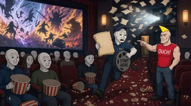
#5 · C005

The Real Failure - Missing Context

So when Spoolcast made a confusing video about Spoolcast, the issue was not that the topic was too advanced.
The issue was that the video assumed the viewer already knew the system.
✓ narration ✓ render gpt-image-2-image-to-image
Flat-shaded cartoon illustration in the modern wojak-comic style, matching the provided wojak-gpt2 reference when one is supplied. Keep classic wojak meme-comic anatomy: pale gray or muted skin, rough hand-drawn facial linework, simple expressive faces, hollow eyes when the beat calls for a doomer reaction, and confident meme-comic contrast only when the prompt asks for it. Avoid glossy anime, heroic superhero posters, polished corporate illustration, semi-realistic concept art, cinematic fantasy art, manga styling, and generic webcomic polish. Use soft cel shading with deliberate color contrast and at least one scene-motivated accent color when the beat supports it. Stage the frame as a memorable set-piece with visible action, physical consequence, expressive reaction, absurd prop, or specific joke. Do not default to desks, monitors, paperwork, brown rooms, gray rooms, or generic control panels. Backgrounds should be detailed enough to make the moment feel specific, while the main action remains readable. Composition is a single readable comic-style frame with one focal idea, not a comic page. Do not split the image into panels, grids, storyboards, or several mini-scenes unless the scene prompt explicitly requests a before/after or A/B comparison. Avoid dense readable text inside the generated image; screens, papers, and boards should use abstract marks unless exact on-screen text is explicitly declared. Visual digestibility guard: render ONE single-scene illustration with one clear focal idea. Do NOT create a multi-panel comic page, triptych, grid, storyboard, timeline strip, collage, or several mini-scenes in one image unless the scene prompt explicitly asks for a before/after or A/B comparison. Avoid text-heavy posters, dense checklists, whiteboards, document pages, speech bubbles, and dashboards full of tiny readable labels. Use zero extra legible text beyond the declared on_screen_text. Any screens, papers, sticky notes, code editors, charts, or dashboards should show simple abstract marks, blocks, icons, or unreadable texture unless declared text is the whole point of the shot. The viewer should understand the image in about two seconds while narration carries the details. Scene: Fast punchline frame: the builder peels back a shiny fix label and reveals a giant red PROBLEM stamp underneath, with tangled subtitle strips and confused audience silhouettes spilling out. Meme-chad appears as the exact locked meme-Chad identity: clean-shaven, no beard, yellow pointed mohawk-spike hair, red ripped-sleeve OUCH! shirt, muscular arms, smug half-smile, giving a too-early thumbs-up beside the mess. Chad is a full in-frame comedic contrast character with the same meme identity from earlier devlogs. Render exactly this text on the frame, hand-lettered in the session style: "PROBLEM". Reference-image scope: use any image_input ONLY for recurring character identity AND drawing-detail quality: face shape, body type, clothing silhouette, rough wojak linework, handmade prop rendering, layered object density, small physical details, texture, and soft cel-shaded depth. Do NOT copy the reference image's room, desk setup, monitors, exact props, background layout, lighting mood, color palette, camera angle, text, or workplace setting. The Scene text controls the environment, action, palette accents, props, and joke.
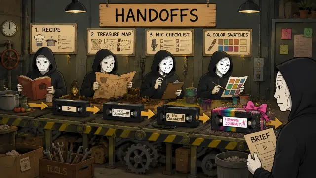
#6 · C006

Chain Of Handoffs

It started talking about technical locks, proof notes, checks, and rule files before explaining the simpler problem underneath: Spoolcast is a chain of handoffs.
One helper figures out the story. Another writes. Another plans the visuals. Another checks the output.
If those helpers are reading different rulebooks, the final video can sound organized and still make no sense.
✓ narration ✓ render gpt-image-2-image-to-image
Flat-shaded cartoon illustration in the modern wojak-comic style, matching the provided wojak-gpt2 reference when one is supplied. Keep classic wojak meme-comic anatomy: pale gray or muted skin, rough hand-drawn facial linework, simple expressive faces, hollow eyes when the beat calls for a doomer reaction, and confident meme-comic contrast only when the prompt asks for it. Avoid glossy anime, heroic superhero posters, polished corporate illustration, semi-realistic concept art, cinematic fantasy art, manga styling, and generic webcomic polish. Use soft cel shading with deliberate color contrast and at least one scene-motivated accent color when the beat supports it. Stage the frame as a memorable set-piece with visible action, physical consequence, expressive reaction, absurd prop, or specific joke. Do not default to desks, monitors, paperwork, brown rooms, gray rooms, or generic control panels. Backgrounds should be detailed enough to make the moment feel specific, while the main action remains readable. Composition is a single readable comic-style frame with one focal idea, not a comic page. Do not split the image into panels, grids, storyboards, or several mini-scenes unless the scene prompt explicitly requests a before/after or A/B comparison. Avoid dense readable text inside the generated image; screens, papers, and boards should use abstract marks unless exact on-screen text is explicitly declared. Visual digestibility guard: render ONE single-scene illustration with one clear focal idea. Do NOT create a multi-panel comic page, triptych, grid, storyboard, timeline strip, collage, or several mini-scenes in one image unless the scene prompt explicitly asks for a before/after or A/B comparison. Avoid text-heavy posters, dense checklists, whiteboards, document pages, speech bubbles, and dashboards full of tiny readable labels. Use zero extra legible text beyond the declared on_screen_text. Any screens, papers, sticky notes, code editors, charts, or dashboards should show simple abstract marks, blocks, icons, or unreadable texture unless declared text is the whole point of the shot. The viewer should understand the image in about two seconds while narration carries the details. Scene: Game-show style question moment: the builder pulls a big lever that lights up a giant WHY CONFUSING? board, while the ai-figure nervously slides three scrambled video frames onto a conveyor. The board uses bright colored bulbs, numbered slots, and one oversized question mark, like the episode is turning confusion into a solvable challenge. Keep the action playful and readable. Render exactly this text on the frame, hand-lettered in the session style: "WHY CONFUSING?". Reference-image scope: use any image_input ONLY for recurring character identity AND drawing-detail quality: face shape, body type, clothing silhouette, rough wojak linework, handmade prop rendering, layered object density, small physical details, texture, and soft cel-shaded depth. Do NOT copy the reference image's room, desk setup, monitors, exact props, background layout, lighting mood, color palette, camera angle, text, or workplace setting. The Scene text controls the environment, action, palette accents, props, and joke.
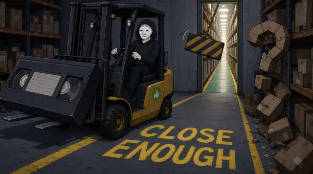
#7 · C007

Almost-Right Instructions

That is what I mean by "skipping rules." It is not always dramatic.
Sometimes the system does not ignore an instruction. It follows the nearest almost-right instruction, misses the one that mattered, and keeps moving with confidence.
Extremely relatable. Unfortunately also bad.
✓ narration ✓ render gpt-image-2-image-to-image
Flat-shaded cartoon illustration in the modern wojak-comic style, matching the provided wojak-gpt2 reference when one is supplied. Keep classic wojak meme-comic anatomy: pale gray or muted skin, rough hand-drawn facial linework, simple expressive faces, hollow eyes when the beat calls for a doomer reaction, and confident meme-comic contrast only when the prompt asks for it. Avoid glossy anime, heroic superhero posters, polished corporate illustration, semi-realistic concept art, cinematic fantasy art, manga styling, and generic webcomic polish. Use soft cel shading with deliberate color contrast and at least one scene-motivated accent color when the beat supports it. Stage the frame as a memorable set-piece with visible action, physical consequence, expressive reaction, absurd prop, or specific joke. Do not default to desks, monitors, paperwork, brown rooms, gray rooms, or generic control panels. Backgrounds should be detailed enough to make the moment feel specific, while the main action remains readable. Composition is a single readable comic-style frame with one focal idea, not a comic page. Do not split the image into panels, grids, storyboards, or several mini-scenes unless the scene prompt explicitly requests a before/after or A/B comparison. Avoid dense readable text inside the generated image; screens, papers, and boards should use abstract marks unless exact on-screen text is explicitly declared. Visual digestibility guard: render ONE single-scene illustration with one clear focal idea. Do NOT create a multi-panel comic page, triptych, grid, storyboard, timeline strip, collage, or several mini-scenes in one image unless the scene prompt explicitly asks for a before/after or A/B comparison. Avoid text-heavy posters, dense checklists, whiteboards, document pages, speech bubbles, and dashboards full of tiny readable labels. Use zero extra legible text beyond the declared on_screen_text. Any screens, papers, sticky notes, code editors, charts, or dashboards should show simple abstract marks, blocks, icons, or unreadable texture unless declared text is the whole point of the shot. The viewer should understand the image in about two seconds while narration carries the details. Scene: Pit-stop repair gag: the video machine sits on a bright service platform while the builder swaps a faulty cartridge for a new one labeled NEXT ONE. The ai-figure holds a checklist of icons only, while colored indicator lights move from red to green. Use wrench action, loose screws, a clean replacement part, and a racing-pit energy so the promise feels concrete instead of abstract. Render exactly this text on the frame, hand-lettered in the session style: "NEXT ONE". Reference-image scope: use any image_input ONLY for recurring character identity AND drawing-detail quality: face shape, body type, clothing silhouette, rough wojak linework, handmade prop rendering, layered object density, small physical details, texture, and soft cel-shaded depth. Do NOT copy the reference image's room, desk setup, monitors, exact props, background layout, lighting mood, color palette, camera angle, text, or workplace setting. The Scene text controls the environment, action, palette accents, props, and joke.
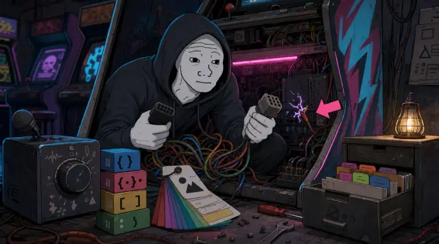
#8 · C008

The Review Found The Mess

The first review found that this was happening in the rule map itself.
Voice rules lived in multiple places. Visual style lived in docs, JSON, session files, and repeated shot-list text.
Some docs pointed at files that no longer existed. Some scripts still treated old rule files like they were current.
✓ narration ✓ render gpt-image-2-image-to-image
Flat-shaded cartoon illustration in the modern wojak-comic style, matching the provided wojak-gpt2 reference when one is supplied. Keep classic wojak meme-comic anatomy: pale gray or muted skin, rough hand-drawn facial linework, simple expressive faces, hollow eyes when the beat calls for a doomer reaction, and confident meme-comic contrast only when the prompt asks for it. Avoid glossy anime, heroic superhero posters, polished corporate illustration, semi-realistic concept art, cinematic fantasy art, manga styling, and generic webcomic polish. Use soft cel shading with deliberate color contrast and at least one scene-motivated accent color when the beat supports it. Stage the frame as a memorable set-piece with visible action, physical consequence, expressive reaction, absurd prop, or specific joke. Do not default to desks, monitors, paperwork, brown rooms, gray rooms, or generic control panels. Backgrounds should be detailed enough to make the moment feel specific, while the main action remains readable. Composition is a single readable comic-style frame with one focal idea, not a comic page. Do not split the image into panels, grids, storyboards, or several mini-scenes unless the scene prompt explicitly requests a before/after or A/B comparison. Avoid dense readable text inside the generated image; screens, papers, and boards should use abstract marks unless exact on-screen text is explicitly declared. Visual digestibility guard: render ONE single-scene illustration with one clear focal idea. Do NOT create a multi-panel comic page, triptych, grid, storyboard, timeline strip, collage, or several mini-scenes in one image unless the scene prompt explicitly asks for a before/after or A/B comparison. Avoid text-heavy posters, dense checklists, whiteboards, document pages, speech bubbles, and dashboards full of tiny readable labels. Use zero extra legible text beyond the declared on_screen_text. Any screens, papers, sticky notes, code editors, charts, or dashboards should show simple abstract marks, blocks, icons, or unreadable texture unless declared text is the whole point of the shot. The viewer should understand the image in about two seconds while narration carries the details. Scene: Hero object reveal without a marketing feel: a chunky handmade machine rotates on a simple platform with the sign SPOOLCAST bolted to its side. The builder wipes dust off the sign while the ai-figure plugs in a glowing cable. Surround it with colorful input bins and output reels so the name attaches to an object, not an unexplained label. Render exactly this text on the frame, hand-lettered in the session style: "SPOOLCAST". Reference-image scope: use any image_input ONLY for recurring character identity AND drawing-detail quality: face shape, body type, clothing silhouette, rough wojak linework, handmade prop rendering, layered object density, small physical details, texture, and soft cel-shaded depth. Do NOT copy the reference image's room, desk setup, monitors, exact props, background layout, lighting mood, color palette, camera angle, text, or workplace setting. The Scene text controls the environment, action, palette accents, props, and joke.
#9 · C009

The Riskiest Example

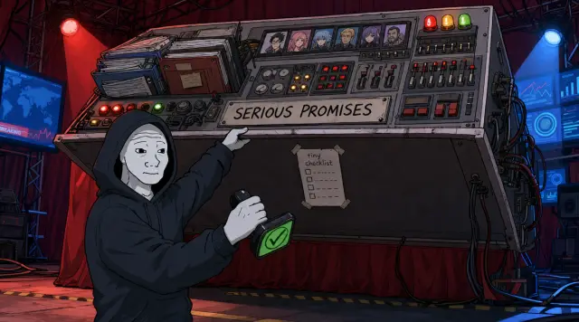
The riskiest example was the news anime show.
Its rules promised careful source handling, topic risk checks, platform compliance, cast continuity, and disclosure.
But the code mostly checked for simple files and markers.
In plain English, the show had serious promises, and the system was checking a tiny checklist.
✓ narration ✓ render gpt-image-2-image-to-image
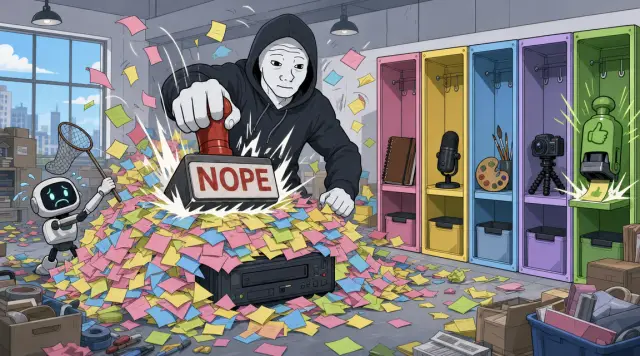
Flat-shaded cartoon illustration in the modern wojak-comic style, matching the provided wojak-gpt2 reference when one is supplied. Keep classic wojak meme-comic anatomy: pale gray or muted skin, rough hand-drawn facial linework, simple expressive faces, hollow eyes when the beat calls for a doomer reaction, and confident meme-comic contrast only when the prompt asks for it. Avoid glossy anime, heroic superhero posters, polished corporate illustration, semi-realistic concept art, cinematic fantasy art, manga styling, and generic webcomic polish. Use soft cel shading with deliberate color contrast and at least one scene-motivated accent color when the beat supports it. Stage the frame as a memorable set-piece with visible action, physical consequence, expressive reaction, absurd prop, or specific joke. Do not default to desks, monitors, paperwork, brown rooms, gray rooms, or generic control panels. Backgrounds should be detailed enough to make the moment feel specific, while the main action remains readable. Composition is a single readable comic-style frame with one focal idea, not a comic page. Do not split the image into panels, grids, storyboards, or several mini-scenes unless the scene prompt explicitly requests a before/after or A/B comparison. Avoid dense readable text inside the generated image; screens, papers, and boards should use abstract marks unless exact on-screen text is explicitly declared. Visual digestibility guard: render ONE single-scene illustration with one clear focal idea. Do NOT create a multi-panel comic page, triptych, grid, storyboard, timeline strip, collage, or several mini-scenes in one image unless the scene prompt explicitly asks for a before/after or A/B comparison. Avoid text-heavy posters, dense checklists, whiteboards, document pages, speech bubbles, and dashboards full of tiny readable labels. Use zero extra legible text beyond the declared on_screen_text. Any screens, papers, sticky notes, code editors, charts, or dashboards should show simple abstract marks, blocks, icons, or unreadable texture unless declared text is the whole point of the shot. The viewer should understand the image in about two seconds while narration carries the details. Scene: Colorful loading-dock scene: the builder tosses five distinct crates into the Spoolcast intake, each represented by icons instead of dense text: chat bubbles, note cards, code blocks, screenshot thumbnails, and feedback stickers. The ai-figure stamps each crate with a scanner wand while the machine chews through them. Make the categories physically different and easy to spot. Render exactly this text on the frame, hand-lettered in the session style: "INPUTS". Reference-image scope: use any image_input ONLY for recurring character identity AND drawing-detail quality: face shape, body type, clothing silhouette, rough wojak linework, handmade prop rendering, layered object density, small physical details, texture, and soft cel-shaded depth. Do NOT copy the reference image's room, desk setup, monitors, exact props, background layout, lighting mood, color palette, camera angle, text, or workplace setting. The Scene text controls the environment, action, palette accents, props, and joke.
#10 · C010

Not Another Prompt

So the first fix was not another prompt.
Another prompt would just become one more place for the instruction to drift.
The first fix was ownership.
✓ narration ✓ render gpt-image-2-image-to-image
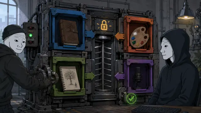
Flat-shaded cartoon illustration in the modern wojak-comic style, matching the provided wojak-gpt2 reference when one is supplied. Keep classic wojak meme-comic anatomy: pale gray or muted skin, rough hand-drawn facial linework, simple expressive faces, hollow eyes when the beat calls for a doomer reaction, and confident meme-comic contrast only when the prompt asks for it. Avoid glossy anime, heroic superhero posters, polished corporate illustration, semi-realistic concept art, cinematic fantasy art, manga styling, and generic webcomic polish. Use soft cel shading with deliberate color contrast and at least one scene-motivated accent color when the beat supports it. Stage the frame as a memorable set-piece with visible action, physical consequence, expressive reaction, absurd prop, or specific joke. Do not default to desks, monitors, paperwork, brown rooms, gray rooms, or generic control panels. Backgrounds should be detailed enough to make the moment feel specific, while the main action remains readable. Composition is a single readable comic-style frame with one focal idea, not a comic page. Do not split the image into panels, grids, storyboards, or several mini-scenes unless the scene prompt explicitly requests a before/after or A/B comparison. Avoid dense readable text inside the generated image; screens, papers, and boards should use abstract marks unless exact on-screen text is explicitly declared. Visual digestibility guard: render ONE single-scene illustration with one clear focal idea. Do NOT create a multi-panel comic page, triptych, grid, storyboard, timeline strip, collage, or several mini-scenes in one image unless the scene prompt explicitly asks for a before/after or A/B comparison. Avoid text-heavy posters, dense checklists, whiteboards, document pages, speech bubbles, and dashboards full of tiny readable labels. Use zero extra legible text beyond the declared on_screen_text. Any screens, papers, sticky notes, code editors, charts, or dashboards should show simple abstract marks, blocks, icons, or unreadable texture unless declared text is the whole point of the shot. The viewer should understand the image in about two seconds while narration carries the details. Scene: Playful assembly-line frame with three big stations, each doing one physical job: a magnet pulls a glowing STORY shape from the messy crate, a typewriter hammers SCRIPT pages, and a storyboard easel lights up SCREEN panels. The builder runs alongside the belt trying to keep up while the ai-figure operates a comically oversized switchboard. Use distinct station colors and moving-belt energy. Render exactly this text on the frame, hand-lettered in the session style: "STORY" | "SCRIPT" | "SCREEN". Reference-image scope: use any image_input ONLY for recurring character identity AND drawing-detail quality: face shape, body type, clothing silhouette, rough wojak linework, handmade prop rendering, layered object density, small physical details, texture, and soft cel-shaded depth. Do NOT copy the reference image's room, desk setup, monitors, exact props, background layout, lighting mood, color palette, camera angle, text, or workplace setting. The Scene text controls the environment, action, palette accents, props, and joke.
#11 · C011

What A Context Gate Means

Story rules live with story. Visual rules live with visuals. The actual style recipe lives with the style data. The devlog voice lives in the devlog voice file.
Show rules only own the things specific to that show.
Only after that does a Context Gate make sense.
✓ narration ✓ render gpt-image-2-image-to-image
Flat-shaded cartoon illustration in the modern wojak-comic style, matching the provided wojak-gpt2 reference when one is supplied. Keep classic wojak meme-comic anatomy: pale gray or muted skin, rough hand-drawn facial linework, simple expressive faces, hollow eyes when the beat calls for a doomer reaction, and confident meme-comic contrast only when the prompt asks for it. Avoid glossy anime, heroic superhero posters, polished corporate illustration, semi-realistic concept art, cinematic fantasy art, manga styling, and generic webcomic polish. Use soft cel shading with deliberate color contrast and at least one scene-motivated accent color when the beat supports it. Stage the frame as a memorable set-piece with visible action, physical consequence, expressive reaction, absurd prop, or specific joke. Do not default to desks, monitors, paperwork, brown rooms, gray rooms, or generic control panels. Backgrounds should be detailed enough to make the moment feel specific, while the main action remains readable. Composition is a single readable comic-style frame with one focal idea, not a comic page. Do not split the image into panels, grids, storyboards, or several mini-scenes unless the scene prompt explicitly requests a before/after or A/B comparison. Avoid dense readable text inside the generated image; screens, papers, and boards should use abstract marks unless exact on-screen text is explicitly declared. Visual digestibility guard: render ONE single-scene illustration with one clear focal idea. Do NOT create a multi-panel comic page, triptych, grid, storyboard, timeline strip, collage, or several mini-scenes in one image unless the scene prompt explicitly asks for a before/after or A/B comparison. Avoid text-heavy posters, dense checklists, whiteboards, document pages, speech bubbles, and dashboards full of tiny readable labels. Use zero extra legible text beyond the declared on_screen_text. Any screens, papers, sticky notes, code editors, charts, or dashboards should show simple abstract marks, blocks, icons, or unreadable texture unless declared text is the whole point of the shot. The viewer should understand the image in about two seconds while narration carries the details. Scene: Continuation of the assembly line in a different section with brighter accent colors: a paint station stamps ART panels, a tiny recording booth lights up AUDIO waveforms, and a toaster-like RENDER oven pops out a finished video reel into a delivery box. The builder catches falling file cards while the ai-figure tries to label the box with icon stickers. Keep it busy, tactile, and obviously downstream from the prior stations. Render exactly this text on the frame, hand-lettered in the session style: "ART" | "AUDIO" | "RENDER". Reference-image scope: use any image_input ONLY for recurring character identity AND drawing-detail quality: face shape, body type, clothing silhouette, rough wojak linework, handmade prop rendering, layered object density, small physical details, texture, and soft cel-shaded depth. Do NOT copy the reference image's room, desk setup, monitors, exact props, background layout, lighting mood, color palette, camera angle, text, or workplace setting. The Scene text controls the environment, action, palette accents, props, and joke.
#12 · C012

Instruction Sheet On The Desk

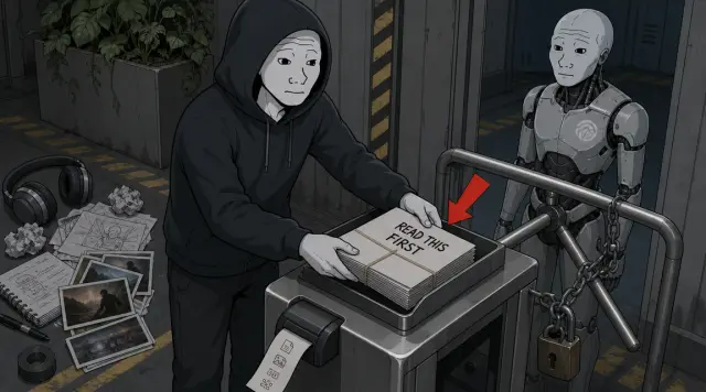
A Context Gate means this: before one of the agent helpers writes something, the system puts the exact rule files in front of it.
Then it leaves a small record of what was loaded, so a later check can confirm the helper had the right instructions.
In normal terms, it is not asking the model to remember better. It is putting the right instruction sheet on the desk before the work starts.
✓ narration ✓ render gpt-image-2-image-to-image
Flat-shaded cartoon illustration in the modern wojak-comic style, matching the provided wojak-gpt2 reference when one is supplied. Keep classic wojak meme-comic anatomy: pale gray or muted skin, rough hand-drawn facial linework, simple expressive faces, hollow eyes when the beat calls for a doomer reaction, and confident meme-comic contrast only when the prompt asks for it. Avoid glossy anime, heroic superhero posters, polished corporate illustration, semi-realistic concept art, cinematic fantasy art, manga styling, and generic webcomic polish. Use soft cel shading with deliberate color contrast and at least one scene-motivated accent color when the beat supports it. Stage the frame as a memorable set-piece with visible action, physical consequence, expressive reaction, absurd prop, or specific joke. Do not default to desks, monitors, paperwork, brown rooms, gray rooms, or generic control panels. Backgrounds should be detailed enough to make the moment feel specific, while the main action remains readable. Composition is a single readable comic-style frame with one focal idea, not a comic page. Do not split the image into panels, grids, storyboards, or several mini-scenes unless the scene prompt explicitly requests a before/after or A/B comparison. Avoid dense readable text inside the generated image; screens, papers, and boards should use abstract marks unless exact on-screen text is explicitly declared. Visual digestibility guard: render ONE single-scene illustration with one clear focal idea. Do NOT create a multi-panel comic page, triptych, grid, storyboard, timeline strip, collage, or several mini-scenes in one image unless the scene prompt explicitly asks for a before/after or A/B comparison. Avoid text-heavy posters, dense checklists, whiteboards, document pages, speech bubbles, and dashboards full of tiny readable labels. Use zero extra legible text beyond the declared on_screen_text. Any screens, papers, sticky notes, code editors, charts, or dashboards should show simple abstract marks, blocks, icons, or unreadable texture unless declared text is the whole point of the shot. The viewer should understand the image in about two seconds while narration carries the details. Scene: Locked turnstile set-piece with exactly two characters: the hooded builder and the ai-figure. No guards, workers, hard hats, uniforms, beards, or extra human helpers. The ai-figure waits behind a small metal turnstile that will not open yet. The builder slides a thick READ THIS FIRST rule bundle into a metal intake tray mounted on the turnstile. Beside it, a tiny receipt printer spits out a strip showing simple file icons, proving what was loaded. A blunt red BEFORE YOU PASS arrow points to the rule bundle before the ai-figure can pass. Include headphones, script scraps, and image thumbnails waiting off to the side, showing this happens before production starts. Render exactly this text on the frame, hand-lettered in the session style: "READ THIS FIRST". Reference-image scope: use any image_input ONLY for recurring character identity AND drawing-detail quality: face shape, body type, clothing silhouette, rough wojak linework, handmade prop rendering, layered object density, small physical details, texture, and soft cel-shaded depth. Do NOT copy the reference image's room, desk setup, monitors, exact props, background layout, lighting mood, color palette, camera angle, text, or workplace setting. The Scene text controls the environment, action, palette accents, props, and joke.
#13 · C013

Blueprint Is Not Safety

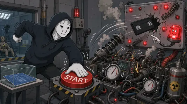
But the cleaned-up map was still only a blueprint. It said which instructions should be loaded.
It did not magically prove the whole process was safe.
Then I tried to make this episode with Spoolcast, and the test immediately found more problems.
✓ narration ✓ render gpt-image-2-image-to-image
Flat-shaded cartoon illustration in the modern wojak-comic style, matching the provided wojak-gpt2 reference when one is supplied. Keep classic wojak meme-comic anatomy: pale gray or muted skin, rough hand-drawn facial linework, simple expressive faces, hollow eyes when the beat calls for a doomer reaction, and confident meme-comic contrast only when the prompt asks for it. Avoid glossy anime, heroic superhero posters, polished corporate illustration, semi-realistic concept art, cinematic fantasy art, manga styling, and generic webcomic polish. Use soft cel shading with deliberate color contrast and at least one scene-motivated accent color when the beat supports it. Stage the frame as a memorable set-piece with visible action, physical consequence, expressive reaction, absurd prop, or specific joke. Do not default to desks, monitors, paperwork, brown rooms, gray rooms, or generic control panels. Backgrounds should be detailed enough to make the moment feel specific, while the main action remains readable. Composition is a single readable comic-style frame with one focal idea, not a comic page. Do not split the image into panels, grids, storyboards, or several mini-scenes unless the scene prompt explicitly requests a before/after or A/B comparison. Avoid dense readable text inside the generated image; screens, papers, and boards should use abstract marks unless exact on-screen text is explicitly declared. Visual digestibility guard: render ONE single-scene illustration with one clear focal idea. Do NOT create a multi-panel comic page, triptych, grid, storyboard, timeline strip, collage, or several mini-scenes in one image unless the scene prompt explicitly asks for a before/after or A/B comparison. Avoid text-heavy posters, dense checklists, whiteboards, document pages, speech bubbles, and dashboards full of tiny readable labels. Use zero extra legible text beyond the declared on_screen_text. Any screens, papers, sticky notes, code editors, charts, or dashboards should show simple abstract marks, blocks, icons, or unreadable texture unless declared text is the whole point of the shot. The viewer should understand the image in about two seconds while narration carries the details. Scene: Crash-test lab gag: a neat blueprint sits safely under glass on a side table while the builder slams a big START button on a ridiculous test rig. The rig launches a tiny video tape into a wall of red warning lights, springs, smoke, and wobbling gauges. A useless smiling warning light points at the failing rig like a mascot. Keep the blueprint small and the failing test action large. Render exactly this text on the frame, hand-lettered in the session style: "START". Reference-image scope: use any image_input ONLY for recurring character identity AND drawing-detail quality: face shape, body type, clothing silhouette, rough wojak linework, handmade prop rendering, layered object density, small physical details, texture, and soft cel-shaded depth. Do NOT copy the reference image's room, desk setup, monitors, exact props, background layout, lighting mood, color palette, camera angle, text, or workplace setting. The Scene text controls the environment, action, palette accents, props, and joke.
#14 · C014

Progress Check Looked Too Far Ahead

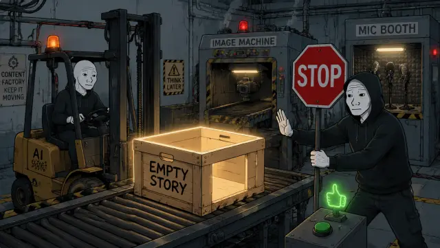
The first problem was progress. Before the system makes images or audio, it needs to know the point of the video.
In this test, the progress check was acting like later production steps were ready even though the story was still missing.
So I changed the process to stop earlier.
✓ narration ✓ render gpt-image-2-image-to-image
Flat-shaded cartoon illustration in the modern wojak-comic style, matching the provided wojak-gpt2 reference when one is supplied. Keep classic wojak meme-comic anatomy: pale gray or muted skin, rough hand-drawn facial linework, simple expressive faces, hollow eyes when the beat calls for a doomer reaction, and confident meme-comic contrast only when the prompt asks for it. Avoid glossy anime, heroic superhero posters, polished corporate illustration, semi-realistic concept art, cinematic fantasy art, manga styling, and generic webcomic polish. Use soft cel shading with deliberate color contrast and at least one scene-motivated accent color when the beat supports it. Stage the frame as a memorable set-piece with visible action, physical consequence, expressive reaction, absurd prop, or specific joke. Do not default to desks, monitors, paperwork, brown rooms, gray rooms, or generic control panels. Backgrounds should be detailed enough to make the moment feel specific, while the main action remains readable. Composition is a single readable comic-style frame with one focal idea, not a comic page. Do not split the image into panels, grids, storyboards, or several mini-scenes unless the scene prompt explicitly requests a before/after or A/B comparison. Avoid dense readable text inside the generated image; screens, papers, and boards should use abstract marks unless exact on-screen text is explicitly declared. Visual digestibility guard: render ONE single-scene illustration with one clear focal idea. Do NOT create a multi-panel comic page, triptych, grid, storyboard, timeline strip, collage, or several mini-scenes in one image unless the scene prompt explicitly asks for a before/after or A/B comparison. Avoid text-heavy posters, dense checklists, whiteboards, document pages, speech bubbles, and dashboards full of tiny readable labels. Use zero extra legible text beyond the declared on_screen_text. Any screens, papers, sticky notes, code editors, charts, or dashboards should show simple abstract marks, blocks, icons, or unreadable texture unless declared text is the whole point of the shot. The viewer should understand the image in about two seconds while narration carries the details. Scene: Factory checkpoint scene: the first station has an empty glowing crate labeled EMPTY STORY sitting on the belt. Downstream, the image machine and microphone booth are already revving up like they are ready to work. The ai-figure forklift is about to push the hollow crate forward, while the builder plants a giant stop paddle in front of it. A useless green thumbs-up light glows beside the belt switch. Add a visible gap inside the crate so the joke is that there is literally no main point inside. Render exactly this text on the frame, hand-lettered in the session style: "EMPTY STORY". Reference-image scope: use any image_input ONLY for recurring character identity AND drawing-detail quality: face shape, body type, clothing silhouette, rough wojak linework, handmade prop rendering, layered object density, small physical details, texture, and soft cel-shaded depth. Do NOT copy the reference image's room, desk setup, monitors, exact props, background layout, lighting mood, color palette, camera angle, text, or workplace setting. The Scene text controls the environment, action, palette accents, props, and joke.
#15 · C015

Do Not Use Last Episode's Instructions

If the main point is missing, stop there. If the structure is missing, stop there. Do not walk down the assembly line when the first station is empty.
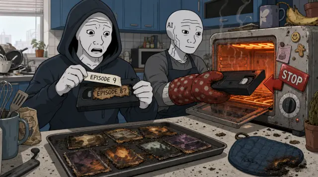
The second problem was stale output.
The final video step could accidentally read old instructions from the previous episode.
That is how episode nine can start looking like episode eight.
✓ narration ✓ render gpt-image-2-image-to-image
Flat-shaded cartoon illustration in the modern wojak-comic style, matching the provided wojak-gpt2 reference when one is supplied. Keep classic wojak meme-comic anatomy: pale gray or muted skin, rough hand-drawn facial linework, simple expressive faces, hollow eyes when the beat calls for a doomer reaction, and confident meme-comic contrast only when the prompt asks for it. Avoid glossy anime, heroic superhero posters, polished corporate illustration, semi-realistic concept art, cinematic fantasy art, manga styling, and generic webcomic polish. Use soft cel shading with deliberate color contrast and at least one scene-motivated accent color when the beat supports it. Stage the frame as a memorable set-piece with visible action, physical consequence, expressive reaction, absurd prop, or specific joke. Do not default to desks, monitors, paperwork, brown rooms, gray rooms, or generic control panels. Backgrounds should be detailed enough to make the moment feel specific, while the main action remains readable. Composition is a single readable comic-style frame with one focal idea, not a comic page. Do not split the image into panels, grids, storyboards, or several mini-scenes unless the scene prompt explicitly requests a before/after or A/B comparison. Avoid dense readable text inside the generated image; screens, papers, and boards should use abstract marks unless exact on-screen text is explicitly declared. Visual digestibility guard: render ONE single-scene illustration with one clear focal idea. Do NOT create a multi-panel comic page, triptych, grid, storyboard, timeline strip, collage, or several mini-scenes in one image unless the scene prompt explicitly asks for a before/after or A/B comparison. Avoid text-heavy posters, dense checklists, whiteboards, document pages, speech bubbles, and dashboards full of tiny readable labels. Use zero extra legible text beyond the declared on_screen_text. Any screens, papers, sticky notes, code editors, charts, or dashboards should show simple abstract marks, blocks, icons, or unreadable texture unless declared text is the whole point of the shot. The viewer should understand the image in about two seconds while narration carries the details. Scene: Render-kitchen gag: the builder peels an EPISODE 9 label off a tape and discovers EPISODE 8? burned underneath like an old price tag. Behind him, a toaster-oven render machine is about to bake that wrong tape into a finished video. The ai-figure wears oven mitts and is seconds from sliding it in. A STOP magnet on the emergency button points at the stale tape while a tray of old thumbnails sits nearby. Make the stale-output danger feel physical and funny. Render exactly this text on the frame, hand-lettered in the session style: "EPISODE 9" | "EPISODE 8?". Reference-image scope: use any image_input ONLY for recurring character identity AND drawing-detail quality: face shape, body type, clothing silhouette, rough wojak linework, handmade prop rendering, layered object density, small physical details, texture, and soft cel-shaded depth. Do NOT copy the reference image's room, desk setup, monitors, exact props, background layout, lighting mood, color palette, camera angle, text, or workplace setting. The Scene text controls the environment, action, palette accents, props, and joke.
#16 · C016

Visual Inserts Are Not Decoration

So I changed that step to rebuild its instructions for the current episode before it starts, then check that it is making the episode it claims to be making.
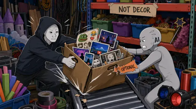
The third problem was visual support.
These videos are supposed to use b-roll, memes, reactions, screenshots, and other real inserts when they help the viewer.
I ask for that constantly, and the system kept treating it like decoration.
✓ narration ✓ render gpt-image-2-image-to-image
Flat-shaded cartoon illustration in the modern wojak-comic style, matching the provided wojak-gpt2 reference when one is supplied. Keep classic wojak meme-comic anatomy: pale gray or muted skin, rough hand-drawn facial linework, simple expressive faces, hollow eyes when the beat calls for a doomer reaction, and confident meme-comic contrast only when the prompt asks for it. Avoid glossy anime, heroic superhero posters, polished corporate illustration, semi-realistic concept art, cinematic fantasy art, manga styling, and generic webcomic polish. Use soft cel shading with deliberate color contrast and at least one scene-motivated accent color when the beat supports it. Stage the frame as a memorable set-piece with visible action, physical consequence, expressive reaction, absurd prop, or specific joke. Do not default to desks, monitors, paperwork, brown rooms, gray rooms, or generic control panels. Backgrounds should be detailed enough to make the moment feel specific, while the main action remains readable. Composition is a single readable comic-style frame with one focal idea, not a comic page. Do not split the image into panels, grids, storyboards, or several mini-scenes unless the scene prompt explicitly requests a before/after or A/B comparison. Avoid dense readable text inside the generated image; screens, papers, and boards should use abstract marks unless exact on-screen text is explicitly declared. Visual digestibility guard: render ONE single-scene illustration with one clear focal idea. Do NOT create a multi-panel comic page, triptych, grid, storyboard, timeline strip, collage, or several mini-scenes in one image unless the scene prompt explicitly asks for a before/after or A/B comparison. Avoid text-heavy posters, dense checklists, whiteboards, document pages, speech bubbles, and dashboards full of tiny readable labels. Use zero extra legible text beyond the declared on_screen_text. Any screens, papers, sticky notes, code editors, charts, or dashboards should show simple abstract marks, blocks, icons, or unreadable texture unless declared text is the whole point of the shot. The viewer should understand the image in about two seconds while narration carries the details. Scene: Backstage prop-room scene: a box of real inserts bursts off a colorful shelf marked NOT DECOR and lands on the main production conveyor. Inside the box are recognizable cards for screenshots, b-roll clips, meme stickers, reaction video frames, and phone recordings. The builder grabs the box handles, and the ai-figure tries to put it back on the shelf. A fake “optional” tag is visibly being ripped off the insert box. Make the inserts colorful and central so they feel necessary, not optional decoration. Render exactly this text on the frame, hand-lettered in the session style: "NOT DECOR". Reference-image scope: use any image_input ONLY for recurring character identity AND drawing-detail quality: face shape, body type, clothing silhouette, rough wojak linework, handmade prop rendering, layered object density, small physical details, texture, and soft cel-shaded depth. Do NOT copy the reference image's room, desk setup, monitors, exact props, background layout, lighting mood, color palette, camera angle, text, or workplace setting. The Scene text controls the environment, action, palette accents, props, and joke.
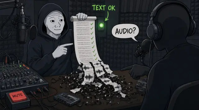
#17 · C017

The Script Was Still The Biggest Problem

So that is now part of the gate too. The screen plan fails if it has no b-roll, meme, or reaction plan, unless there is an explicit approved skip.
But the biggest problem was still the script.
The script could pass line-by-line checks and still fail as audio.
✓ narration ✓ render gpt-image-2-image-to-image
Flat-shaded cartoon illustration in the modern wojak-comic style, matching the provided wojak-gpt2 reference when one is supplied. Keep classic wojak meme-comic anatomy: pale gray or muted skin, rough hand-drawn facial linework, simple expressive faces, hollow eyes when the beat calls for a doomer reaction, and confident meme-comic contrast only when the prompt asks for it. Avoid glossy anime, heroic superhero posters, polished corporate illustration, semi-realistic concept art, cinematic fantasy art, manga styling, and generic webcomic polish. Use soft cel shading with deliberate color contrast and at least one scene-motivated accent color when the beat supports it. Stage the frame as a memorable set-piece with visible action, physical consequence, expressive reaction, absurd prop, or specific joke. Do not default to desks, monitors, paperwork, brown rooms, gray rooms, or generic control panels. Backgrounds should be detailed enough to make the moment feel specific, while the main action remains readable. Composition is a single readable comic-style frame with one focal idea, not a comic page. Do not split the image into panels, grids, storyboards, or several mini-scenes unless the scene prompt explicitly requests a before/after or A/B comparison. Avoid dense readable text inside the generated image; screens, papers, and boards should use abstract marks unless exact on-screen text is explicitly declared. Visual digestibility guard: render ONE single-scene illustration with one clear focal idea. Do NOT create a multi-panel comic page, triptych, grid, storyboard, timeline strip, collage, or several mini-scenes in one image unless the scene prompt explicitly asks for a before/after or A/B comparison. Avoid text-heavy posters, dense checklists, whiteboards, document pages, speech bubbles, and dashboards full of tiny readable labels. Use zero extra legible text beyond the declared on_screen_text. Any screens, papers, sticky notes, code editors, charts, or dashboards should show simple abstract marks, blocks, icons, or unreadable texture unless declared text is the whole point of the shot. The viewer should understand the image in about two seconds while narration carries the details. Scene: Podcast booth scene: a clean transcript scroll with green checkmarks feeds into a pair of oversized headphones worn by a confused listener silhouette. Under the scroll, the audio waveform comes out torn into mismatched strips and tangled cassette tape. The builder holds the transcript like it passed, then notices the listener pointing at the broken waveform. A useless green pass light glows beside the mute button. The contradiction should be obvious: text checks passed, listening failed. Render exactly this text on the frame, hand-lettered in the session style: "TEXT OK" | "AUDIO?". Reference-image scope: use any image_input ONLY for recurring character identity AND drawing-detail quality: face shape, body type, clothing silhouette, rough wojak linework, handmade prop rendering, layered object density, small physical details, texture, and soft cel-shaded depth. Do NOT copy the reference image's room, desk setup, monitors, exact props, background layout, lighting mood, color palette, camera angle, text, or workplace setting. The Scene text controls the environment, action, palette accents, props, and joke.
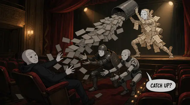
#18 · C018

It Felt Stitched Together

Each piece sounded fine on its own. Together, it felt stitched together.
It did not rebuild the viewer's understanding. It dumped the builder's internal map and hoped the viewer would catch up.
✓ narration ✓ render gpt-image-2-image-to-image
Flat-shaded cartoon illustration in the modern wojak-comic style, matching the provided wojak-gpt2 reference when one is supplied. Keep classic wojak meme-comic anatomy: pale gray or muted skin, rough hand-drawn facial linework, simple expressive faces, hollow eyes when the beat calls for a doomer reaction, and confident meme-comic contrast only when the prompt asks for it. Avoid glossy anime, heroic superhero posters, polished corporate illustration, semi-realistic concept art, cinematic fantasy art, manga styling, and generic webcomic polish. Use soft cel shading with deliberate color contrast and at least one scene-motivated accent color when the beat supports it. Stage the frame as a memorable set-piece with visible action, physical consequence, expressive reaction, absurd prop, or specific joke. Do not default to desks, monitors, paperwork, brown rooms, gray rooms, or generic control panels. Backgrounds should be detailed enough to make the moment feel specific, while the main action remains readable. Composition is a single readable comic-style frame with one focal idea, not a comic page. Do not split the image into panels, grids, storyboards, or several mini-scenes unless the scene prompt explicitly requests a before/after or A/B comparison. Avoid dense readable text inside the generated image; screens, papers, and boards should use abstract marks unless exact on-screen text is explicitly declared. Visual digestibility guard: render ONE single-scene illustration with one clear focal idea. Do NOT create a multi-panel comic page, triptych, grid, storyboard, timeline strip, collage, or several mini-scenes in one image unless the scene prompt explicitly asks for a before/after or A/B comparison. Avoid text-heavy posters, dense checklists, whiteboards, document pages, speech bubbles, and dashboards full of tiny readable labels. Use zero extra legible text beyond the declared on_screen_text. Any screens, papers, sticky notes, code editors, charts, or dashboards should show simple abstract marks, blocks, icons, or unreadable texture unless declared text is the whole point of the shot. The viewer should understand the image in about two seconds while narration carries the details. Scene: Surreal but readable theater scene: a stitched-together script creature made of mismatched scroll pieces tips a bucket of blank gray note cards over a confused viewer silhouette. The cards are heavy enough to bend the viewer seat backward. A clean question bubble in the aisle says CATCH UP? The builder and ai-figure both try to catch the cards before they land. Render exactly this text on the frame, hand-lettered in the session style: "CATCH UP?". Reference-image scope: use any image_input ONLY for recurring character identity AND drawing-detail quality: face shape, body type, clothing silhouette, rough wojak linework, handmade prop rendering, layered object density, small physical details, texture, and soft cel-shaded depth. Do NOT copy the reference image's room, desk setup, monitors, exact props, background layout, lighting mood, color palette, camera angle, text, or workplace setting. The Scene text controls the environment, action, palette accents, props, and joke.
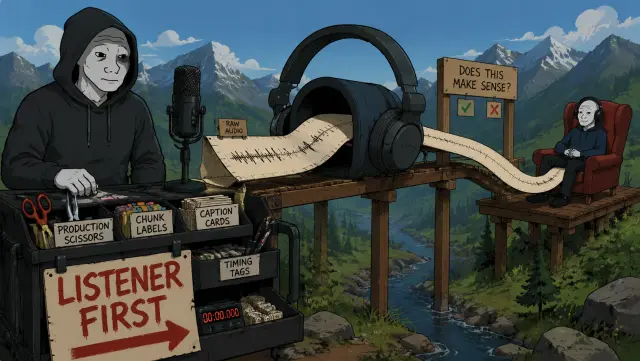
#19 · C019

Continuous Draft First

That is why the script process changed.
The first version now has to be one continuous listener draft. No chunks. No beat labels. No production formatting.
The agent has to write from what the viewer knows so far, not from a list of facts the builder already understands.
✓ narration ✓ render gpt-image-2-image-to-image
Flat-shaded cartoon illustration in the modern wojak-comic style, matching the provided wojak-gpt2 reference when one is supplied. Keep classic wojak meme-comic anatomy: pale gray or muted skin, rough hand-drawn facial linework, simple expressive faces, hollow eyes when the beat calls for a doomer reaction, and confident meme-comic contrast only when the prompt asks for it. Avoid glossy anime, heroic superhero posters, polished corporate illustration, semi-realistic concept art, cinematic fantasy art, manga styling, and generic webcomic polish. Use soft cel shading with deliberate color contrast and at least one scene-motivated accent color when the beat supports it. Stage the frame as a memorable set-piece with visible action, physical consequence, expressive reaction, absurd prop, or specific joke. Do not default to desks, monitors, paperwork, brown rooms, gray rooms, or generic control panels. Backgrounds should be detailed enough to make the moment feel specific, while the main action remains readable. Composition is a single readable comic-style frame with one focal idea, not a comic page. Do not split the image into panels, grids, storyboards, or several mini-scenes unless the scene prompt explicitly requests a before/after or A/B comparison. Avoid dense readable text inside the generated image; screens, papers, and boards should use abstract marks unless exact on-screen text is explicitly declared. Visual digestibility guard: render ONE single-scene illustration with one clear focal idea. Do NOT create a multi-panel comic page, triptych, grid, storyboard, timeline strip, collage, or several mini-scenes in one image unless the scene prompt explicitly asks for a before/after or A/B comparison. Avoid text-heavy posters, dense checklists, whiteboards, document pages, speech bubbles, and dashboards full of tiny readable labels. Use zero extra legible text beyond the declared on_screen_text. Any screens, papers, sticky notes, code editors, charts, or dashboards should show simple abstract marks, blocks, icons, or unreadable texture unless declared text is the whole point of the shot. The viewer should understand the image in about two seconds while narration carries the details. Scene: Audio obstacle-course set-piece: the builder rolls one long clean audio scroll from a microphone through a giant headphone tunnel toward a listener chair. The scroll passes through a simple 'does this make sense?' checkpoint before reaching the viewer. Production scissors, chunk labels, caption cards, and timing tags are locked in a clear toolbox behind the ai-figure, who is waiting impatiently but cannot cut yet. A bright arrow on the toolbox points to the listener first, not the scissors. Make the priority obvious: listen first, split later. Render exactly this text on the frame, hand-lettered in the session style: "LISTENER FIRST". Reference-image scope: use any image_input ONLY for recurring character identity AND drawing-detail quality: face shape, body type, clothing silhouette, rough wojak linework, handmade prop rendering, layered object density, small physical details, texture, and soft cel-shaded depth. Do NOT copy the reference image's room, desk setup, monitors, exact props, background layout, lighting mood, color palette, camera angle, text, or workplace setting. The Scene text controls the environment, action, palette accents, props, and joke.
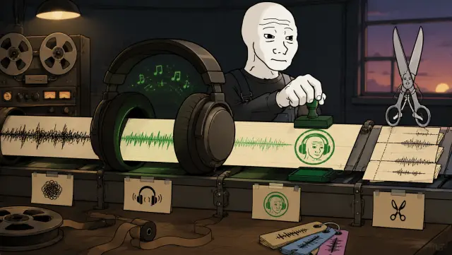
#20 · C020

Then Split For Production

Only after the audio makes sense should the script be chopped into production pieces for visuals, narration files, captions, and render timing.
✓ narration ✓ render gpt-image-2-text-to-image
Flat-shaded cartoon illustration in the modern wojak-comic style, matching the provided wojak-gpt2 reference when one is supplied. Keep classic wojak meme-comic anatomy: pale gray or muted skin, rough hand-drawn facial linework, simple expressive faces, hollow eyes when the beat calls for a doomer reaction, and confident meme-comic contrast only when the prompt asks for it. Avoid glossy anime, heroic superhero posters, polished corporate illustration, semi-realistic concept art, cinematic fantasy art, manga styling, and generic webcomic polish. Use soft cel shading with deliberate color contrast and at least one scene-motivated accent color when the beat supports it. Stage the frame as a memorable set-piece with visible action, physical consequence, expressive reaction, absurd prop, or specific joke. Do not default to desks, monitors, paperwork, brown rooms, gray rooms, or generic control panels. Backgrounds should be detailed enough to make the moment feel specific, while the main action remains readable. Composition is a single readable comic-style frame with one focal idea, not a comic page. Do not split the image into panels, grids, storyboards, or several mini-scenes unless the scene prompt explicitly requests a before/after or A/B comparison. Avoid dense readable text inside the generated image; screens, papers, and boards should use abstract marks unless exact on-screen text is explicitly declared. Visual digestibility guard: render ONE single-scene illustration with one clear focal idea. Do NOT create a multi-panel comic page, triptych, grid, storyboard, timeline strip, collage, or several mini-scenes in one image unless the scene prompt explicitly asks for a before/after or A/B comparison. Avoid text-heavy posters, dense checklists, whiteboards, document pages, speech bubbles, and dashboards full of tiny readable labels. Use zero extra legible text beyond the declared on_screen_text. Any screens, papers, sticky notes, code editors, charts, or dashboards should show simple abstract marks, blocks, icons, or unreadable texture unless declared text is the whole point of the shot. The viewer should understand the image in about two seconds while narration carries the details. Scene: Object-focused production scene: one long audio scroll runs through giant headphones, receives a green listener stamp, then only after that reaches a neat pair of scissors and caption cards downstream. Add a small before/after feeling in one continuous left-to-right scene: tangled waveform before headphones, smooth waveform after headphones, scissors waiting politely at the end. Keep it tactile with tape reels, a stamp pad, and timing tags, not empty minimalism.
#21 · C021

The Useful Lesson

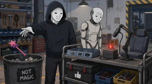
That is the useful lesson from this pass. Context Gates are not magic.
They only help when the source files are clear, the checks look for real failures, and the script builds understanding like a human conversation.
✓ narration ✓ render gpt-image-2-image-to-image
Flat-shaded cartoon illustration in the modern wojak-comic style, matching the provided wojak-gpt2 reference when one is supplied. Keep classic wojak meme-comic anatomy: pale gray or muted skin, rough hand-drawn facial linework, simple expressive faces, hollow eyes when the beat calls for a doomer reaction, and confident meme-comic contrast only when the prompt asks for it. Avoid glossy anime, heroic superhero posters, polished corporate illustration, semi-realistic concept art, cinematic fantasy art, manga styling, and generic webcomic polish. Use soft cel shading with deliberate color contrast and at least one scene-motivated accent color when the beat supports it. Stage the frame as a memorable set-piece with visible action, physical consequence, expressive reaction, absurd prop, or specific joke. Do not default to desks, monitors, paperwork, brown rooms, gray rooms, or generic control panels. Backgrounds should be detailed enough to make the moment feel specific, while the main action remains readable. Composition is a single readable comic-style frame with one focal idea, not a comic page. Do not split the image into panels, grids, storyboards, or several mini-scenes unless the scene prompt explicitly requests a before/after or A/B comparison. Avoid dense readable text inside the generated image; screens, papers, and boards should use abstract marks unless exact on-screen text is explicitly declared. Visual digestibility guard: render ONE single-scene illustration with one clear focal idea. Do NOT create a multi-panel comic page, triptych, grid, storyboard, timeline strip, collage, or several mini-scenes in one image unless the scene prompt explicitly asks for a before/after or A/B comparison. Avoid text-heavy posters, dense checklists, whiteboards, document pages, speech bubbles, and dashboards full of tiny readable labels. Use zero extra legible text beyond the declared on_screen_text. Any screens, papers, sticky notes, code editors, charts, or dashboards should show simple abstract marks, blocks, icons, or unreadable texture unless declared text is the whole point of the shot. The viewer should understand the image in about two seconds while narration carries the details. Scene: Repair-shop set-piece: the builder tosses a cheap glittery magic wand into a trash bin labeled NOT MAGIC while the ai-figure looks disappointed. On a side platform, three sturdy tools are being used for real: a clean source tray with objects in the right slots, a failure detector with a red light, and a conversation microphone aimed at a listener chair. A plain thumbs-up label on the toolbox points to the boring useful tools. Make the scene practical and funny, not triumphant: the wand is silly, the tools are boring but useful. Render exactly this text on the frame, hand-lettered in the session style: "NOT MAGIC". Reference-image scope: use any image_input ONLY for recurring character identity AND drawing-detail quality: face shape, body type, clothing silhouette, rough wojak linework, handmade prop rendering, layered object density, small physical details, texture, and soft cel-shaded depth. Do NOT copy the reference image's room, desk setup, monitors, exact props, background layout, lighting mood, color palette, camera angle, text, or workplace setting. The Scene text controls the environment, action, palette accents, props, and joke.
#22 · C022

Run The Cleaner Script

So the next step is not to celebrate the lock.
The next step is to run this cleaner script through the system and see what still breaks.
✓ narration ✓ render gpt-image-2-image-to-image
Flat-shaded cartoon illustration in the modern wojak-comic style, matching the provided wojak-gpt2 reference when one is supplied. Keep classic wojak meme-comic anatomy: pale gray or muted skin, rough hand-drawn facial linework, simple expressive faces, hollow eyes when the beat calls for a doomer reaction, and confident meme-comic contrast only when the prompt asks for it. Avoid glossy anime, heroic superhero posters, polished corporate illustration, semi-realistic concept art, cinematic fantasy art, manga styling, and generic webcomic polish. Use soft cel shading with deliberate color contrast and at least one scene-motivated accent color when the beat supports it. Stage the frame as a memorable set-piece with visible action, physical consequence, expressive reaction, absurd prop, or specific joke. Do not default to desks, monitors, paperwork, brown rooms, gray rooms, or generic control panels. Backgrounds should be detailed enough to make the moment feel specific, while the main action remains readable. Composition is a single readable comic-style frame with one focal idea, not a comic page. Do not split the image into panels, grids, storyboards, or several mini-scenes unless the scene prompt explicitly requests a before/after or A/B comparison. Avoid dense readable text inside the generated image; screens, papers, and boards should use abstract marks unless exact on-screen text is explicitly declared. Visual digestibility guard: render ONE single-scene illustration with one clear focal idea. Do NOT create a multi-panel comic page, triptych, grid, storyboard, timeline strip, collage, or several mini-scenes in one image unless the scene prompt explicitly asks for a before/after or A/B comparison. Avoid text-heavy posters, dense checklists, whiteboards, document pages, speech bubbles, and dashboards full of tiny readable labels. Use zero extra legible text beyond the declared on_screen_text. Any screens, papers, sticky notes, code editors, charts, or dashboards should show simple abstract marks, blocks, icons, or unreadable texture unless declared text is the whole point of the shot. The viewer should understand the image in about two seconds while narration carries the details. Scene: Test-track scene for the video machine: the builder pushes a clean script bundle into the input slot while the ai-figure lowers a protective blast shield over the output. Beside the output slot are a crash helmet, fire extinguisher, spare tape reels, and abstract checkboxes. A small stopwatch starts the test timer. The machine lights up like an experiment, not a victory lap, and one small bolt is already bouncing loose. Render exactly this text on the frame, hand-lettered in the session style: "TEST RUN". Reference-image scope: use any image_input ONLY for recurring character identity AND drawing-detail quality: face shape, body type, clothing silhouette, rough wojak linework, handmade prop rendering, layered object density, small physical details, texture, and soft cel-shaded depth. Do NOT copy the reference image's room, desk setup, monitors, exact props, background layout, lighting mood, color palette, camera angle, text, or workplace setting. The Scene text controls the environment, action, palette accents, props, and joke.
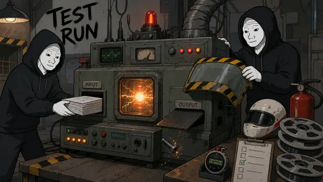
#23 · C023

Audience Check

And honestly, that leaves one useful question. You made it to the end, so tell me: did this one actually make sense?
If yes, the process got a little better. If no, annoyingly, the gate still has work to do.
✓ narration ✓ render gpt-image-2-image-to-image
Flat-shaded cartoon illustration in the modern wojak-comic style, matching the provided wojak-gpt2 reference when one is supplied. Keep classic wojak meme-comic anatomy: pale gray or muted skin, rough hand-drawn facial linework, simple expressive faces, hollow eyes when the beat calls for a doomer reaction, and confident meme-comic contrast only when the prompt asks for it. Avoid glossy anime, heroic superhero posters, polished corporate illustration, semi-realistic concept art, cinematic fantasy art, manga styling, and generic webcomic polish. Use soft cel shading with deliberate color contrast and at least one scene-motivated accent color when the beat supports it. Stage the frame as a memorable set-piece with visible action, physical consequence, expressive reaction, absurd prop, or specific joke. Do not default to desks, monitors, paperwork, brown rooms, gray rooms, or generic control panels. Backgrounds should be detailed enough to make the moment feel specific, while the main action remains readable. Composition is a single readable comic-style frame with one focal idea, not a comic page. Do not split the image into panels, grids, storyboards, or several mini-scenes unless the scene prompt explicitly requests a before/after or A/B comparison. Avoid dense readable text inside the generated image; screens, papers, and boards should use abstract marks unless exact on-screen text is explicitly declared. Visual digestibility guard: render ONE single-scene illustration with one clear focal idea. Do NOT create a multi-panel comic page, triptych, grid, storyboard, timeline strip, collage, or several mini-scenes in one image unless the scene prompt explicitly asks for a before/after or A/B comparison. Avoid text-heavy posters, dense checklists, whiteboards, document pages, speech bubbles, and dashboards full of tiny readable labels. Use zero extra legible text beyond the declared on_screen_text. Any screens, papers, sticky notes, code editors, charts, or dashboards should show simple abstract marks, blocks, icons, or unreadable texture unless declared text is the whole point of the shot. The viewer should understand the image in about two seconds while narration carries the details. Scene: Direct-to-viewer ending scene: the builder holds the finished tape out toward the camera like handing it to the audience. The tape is a little smoky but intact. Behind him, the ai-figure is sweeping up loose notes. The video machine in the background is still smoking slightly, with a tiny wrench and coffee cup on top. A big empty comment bubble hangs over an audience seat, pointing back at the viewer. The tone should be self-aware: the real test is whether the viewer understood it. Render exactly this text on the frame, hand-lettered in the session style: "DID IT MAKE SENSE?". Reference-image scope: use any image_input ONLY for recurring character identity AND drawing-detail quality: face shape, body type, clothing silhouette, rough wojak linework, handmade prop rendering, layered object density, small physical details, texture, and soft cel-shaded depth. Do NOT copy the reference image's room, desk setup, monitors, exact props, background layout, lighting mood, color palette, camera angle, text, or workplace setting. The Scene text controls the environment, action, palette accents, props, and joke.
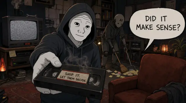
I built a tool that can turn a messy work session into a finished video. Then I watched the video it made about making itself safer, and I got lost in under a minute. The weird part is, the video was supposed to explain the fix. Instead, it proved the problem. So this episode has one job: help you understand why that first video was confusing, and what I changed so the next one is less likely to lose you. The tool is called Spoolcast. I give it chats, notes, code changes, screenshots, and feedback. It helps find the point of the story, write the script, plan what should be on screen, create visuals and narration, make the final video, and prepare the files around it. So when Spoolcast made a confusing video about Spoolcast, the issue was not that the topic was too advanced. The issue was that the video assumed the viewer already knew the system. It started talking about technical locks, proof notes, checks, and rule files before explaining the simpler problem underneath: Spoolcast is a chain of handoffs. One helper figures out the story. Another writes. Another plans the visuals. Another checks the output. If those helpers are reading different rulebooks, the final video can sound organized and still make no sense. That is what I mean by "skipping rules." It is not always dramatic. Sometimes the system does not ignore an instruction. It follows the nearest almost-right instruction, misses the one that mattered, and keeps moving with confidence. Extremely relatable. Unfortunately also bad. The first review found that this was happening in the rule map itself. Voice rules lived in multiple places. Visual style lived in docs, JSON, session files, and repeated shot-list text. Some docs pointed at files that no longer existed. Some scripts still treated old rule files like they were current. The riskiest example was the news anime show. Its rules promised careful source handling, topic risk checks, platform compliance, cast continuity, and disclosure. But the code mostly checked for simple files and markers. In plain English, the show had serious promises, and the system was checking a tiny checklist. So the first fix was not another prompt. Another prompt would just become one more place for the instruction to drift. The first fix was ownership. Story rules live with story. Visual rules live with visuals. The actual style recipe lives with the style data. The devlog voice lives in the devlog voice file. Show rules only own the things specific to that show. Only after that does a Context Gate make sense. A Context Gate means this: before one of the agent helpers writes something, the system puts the exact rule files in front of it. Then it leaves a small record of what was loaded, so a later check can confirm the helper had the right instructions. In normal terms, it is not asking the model to remember better. It is putting the right instruction sheet on the desk before the work starts. But the cleaned-up map was still only a blueprint. It said which instructions should be loaded. It did not magically prove the whole process was safe. Then I tried to make this episode with Spoolcast, and the test immediately found more problems. The first problem was progress. Before the system makes images or audio, it needs to know the point of the video. In this test, the progress check was acting like later production steps were ready even though the story was still missing. So I changed the process to stop earlier. If the main point is missing, stop there. If the structure is missing, stop there. Do not walk down the assembly line when the first station is empty. The second problem was stale output. The final video step could accidentally read old instructions from the previous episode. That is how episode nine can start looking like episode eight. So I changed that step to rebuild its instructions for the current episode before it starts, then check that it is making the episode it claims to be making. The third problem was visual support. These videos are supposed to use b-roll, memes, reactions, screenshots, and other real inserts when they help the viewer. I ask for that constantly, and the system kept treating it like decoration. So that is now part of the gate too. The screen plan fails if it has no b-roll, meme, or reaction plan, unless there is an explicit approved skip. But the biggest problem was still the script. The script could pass line-by-line checks and still fail as audio. Each piece sounded fine on its own. Together, it felt stitched together. It did not rebuild the viewer's understanding. It dumped the builder's internal map and hoped the viewer would catch up. That is why the script process changed. The first version now has to be one continuous listener draft. No chunks. No beat labels. No production formatting. The agent has to write from what the viewer knows so far, not from a list of facts the builder already understands. Only after the audio makes sense should the script be chopped into production pieces for visuals, narration files, captions, and render timing. That is the useful lesson from this pass. Context Gates are not magic. They only help when the source files are clear, the checks look for real failures, and the script builds understanding like a human conversation. So the next step is not to celebrate the lock. The next step is to run this cleaner script through the system and see what still breaks. And honestly, that leaves one useful question. You made it to the end, so tell me: did this one actually make sense? If yes, the process got a little better. If no, annoyingly, the gate still has work to do.